
CalArts: Environmental Graphics
The challenge. CalArts wanted its main building to greet prospective students, parents, and the current community with one message: Welcome. You belong here. The tone had to be playful and irreverent, true to the school’s “plork” (play + work) spirit, while staying serious about art and art-making. The work also had to look good on Instagram and TikTok.
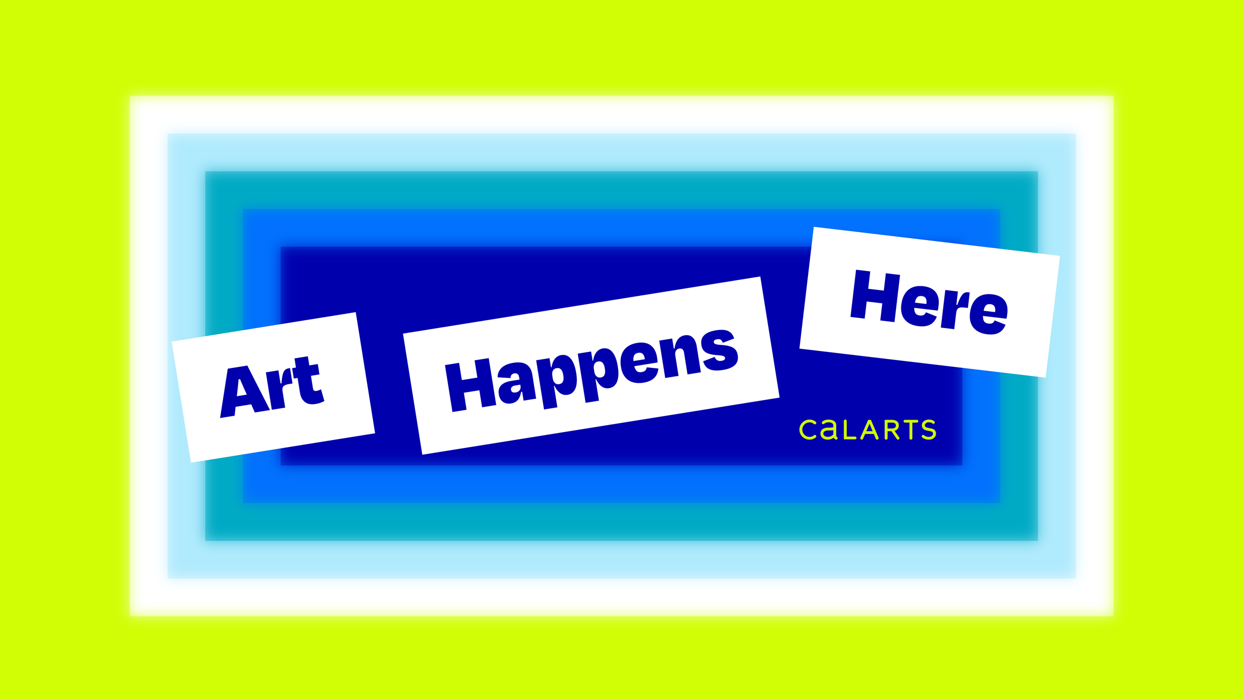
The idea: Art Happens Here. Rather than promote the institution, we put the student at the center. A stacked, shifting arrangement of words names the real stages of an artist’s evolution, including the messy ones. It tells students that their presence has value, not just their output. The line reads true on day one or day 300, whatever point of the journey a student is at.
The system
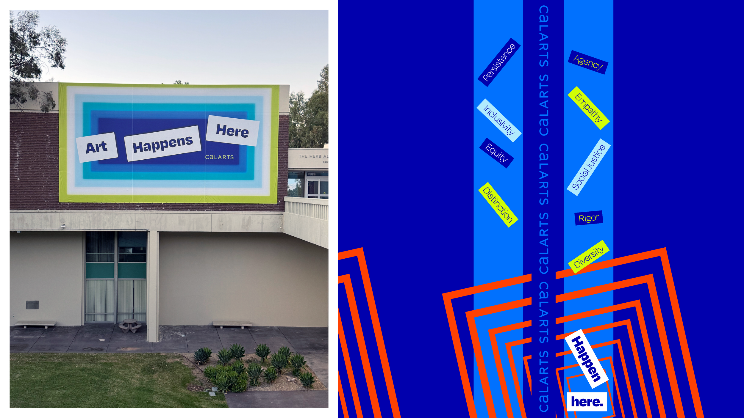
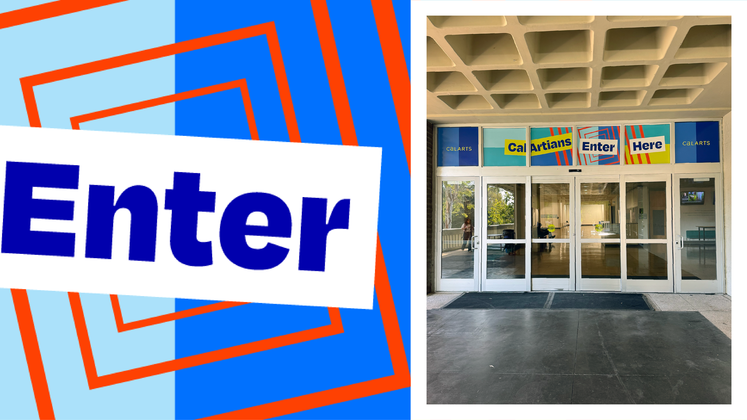
Concentric portals. Nested rectangles pull the eye inward and hold it there, a visual version of being refined within a community.
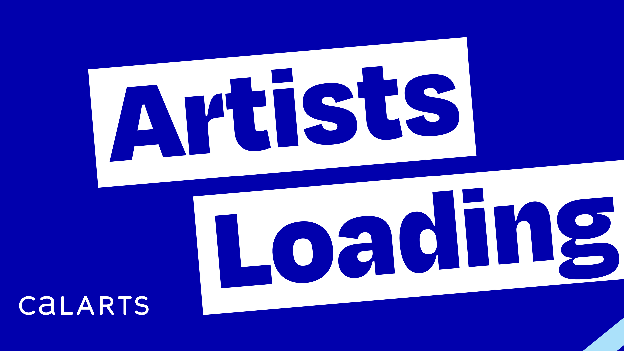
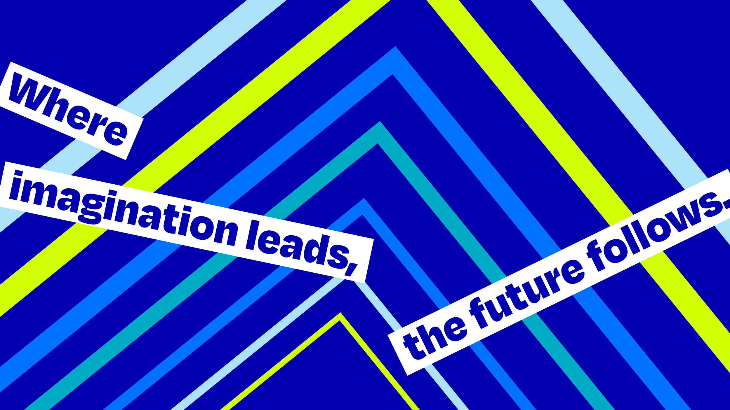
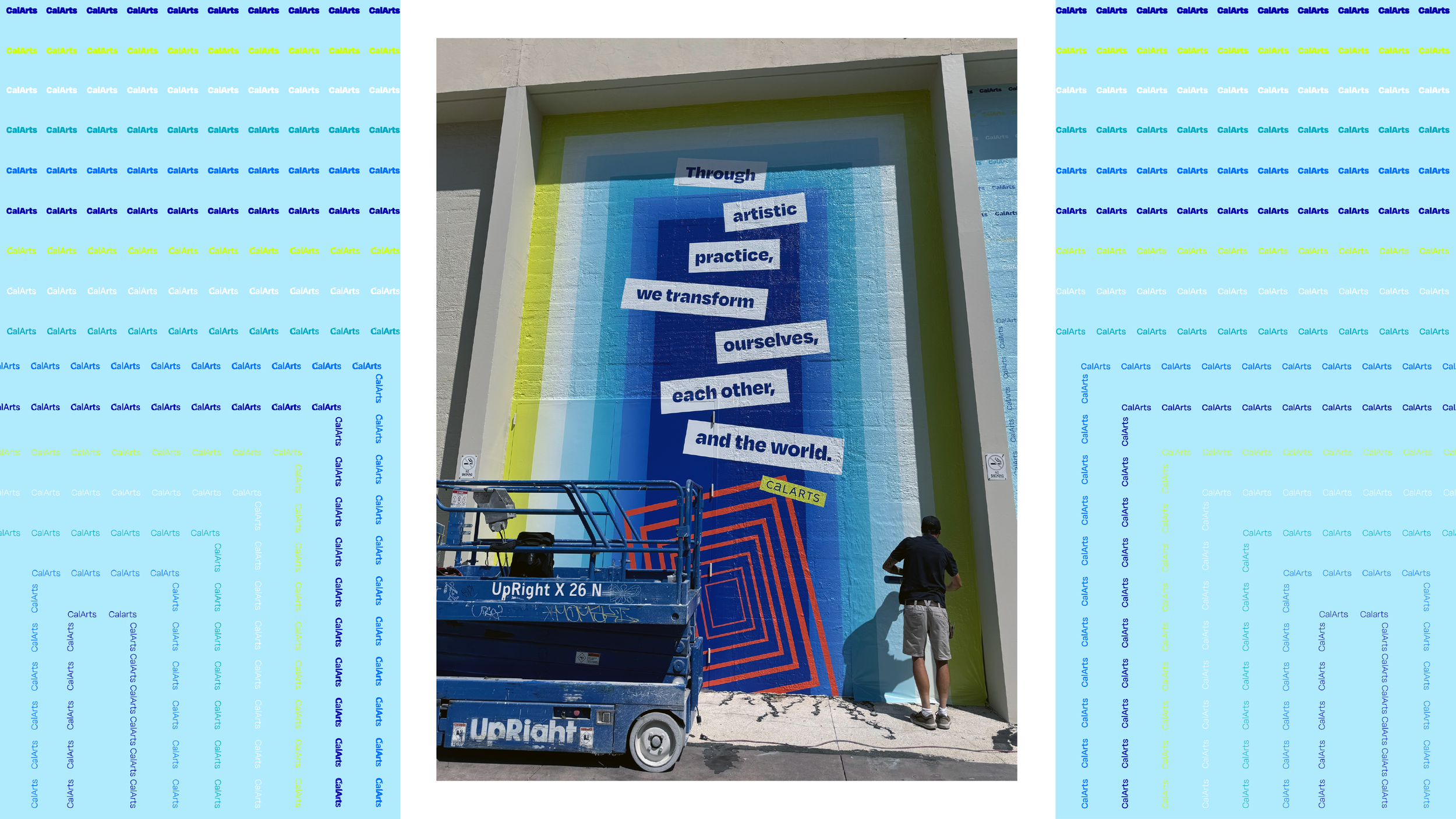
Bold, manifesto-style type. Tilted cut-paper labels carry lines like “Through artistic practice, we transform ourselves, each other, and the world.”
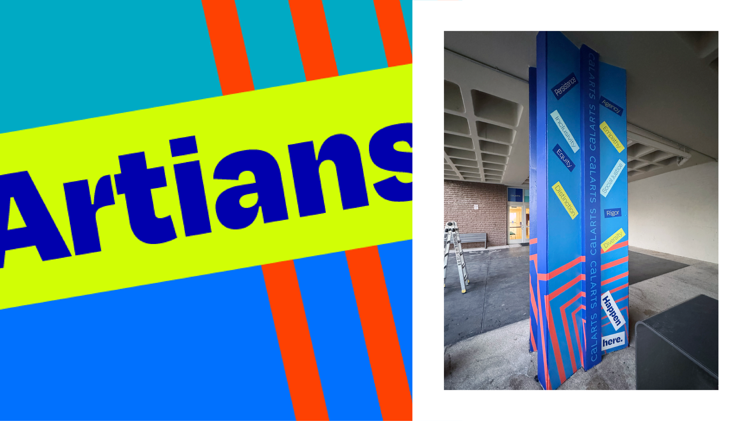
High-contrast color. Chartreuse, cobalt, sky blue and a vibrating orange-red give a shape-driven, Swiss-inflected look.
Words that move. The stacked, shifting type shows change over time, so the identity keeps evolving.
The rollout. The system covers a 45 × 32-foot building banner, a three-panel triptych wall, window graphics, column wraps and banners (naming values like Agency, Empathy, Rigor and Diversity), and Instagram and TikTok templates. Wayfinding gets the same voice, from “CalArtians Enter Here” at the door to “Artists Loading” at the loading dock.